Okay so we were given this assignment: Create a drawing using Prisma color pencils of something that reflects
I thought the typical: sunglass, water, beer bottles? Everyday objects that we all know reflect.
But, I love creating ideas and branching out.
Though with this assignment, I played it safe when it came to "creativity' and uniqueness. Instead I thought of something simple that reflected - but, also reflected myself personally.
When I was younger pinwheels were a must-have. I mean, the more pinwheels the merrier. We had a bunch that would stick in flower pots on my porch. I loved to blow them, of course to watch them spin.
A dinging came in my head when I saw a pinwheel on my art teacher's desk. Foil pinwheel's clearly reflect and they're pretty cool to look at.
The struggle was that it was Prisma color pencils. Yes, though I do prefer pencil, it was a challenge just trying to make the colors mate beautifully And as I continue to blend, groan, start over and blend some more they mated - and produced this baby. What I truly love is the colors, they're sweet and I tried my absolute best to get the color that was best similar and satisfying. But, what wasn't satisfying was the background. Though intense with much "detail" I was hoping I did something more than had a big empty space filled with void. Grass. Sigh. But, practice makes perfect and this is truly a progression from my first try with Prisma in drawing class. With more practice (and patience, oh and time) I will surely get the hand of this. I hope to continue to add more to this in the future.
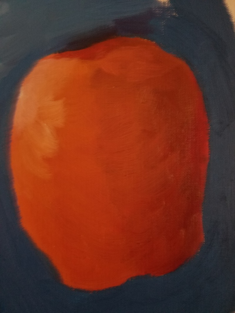
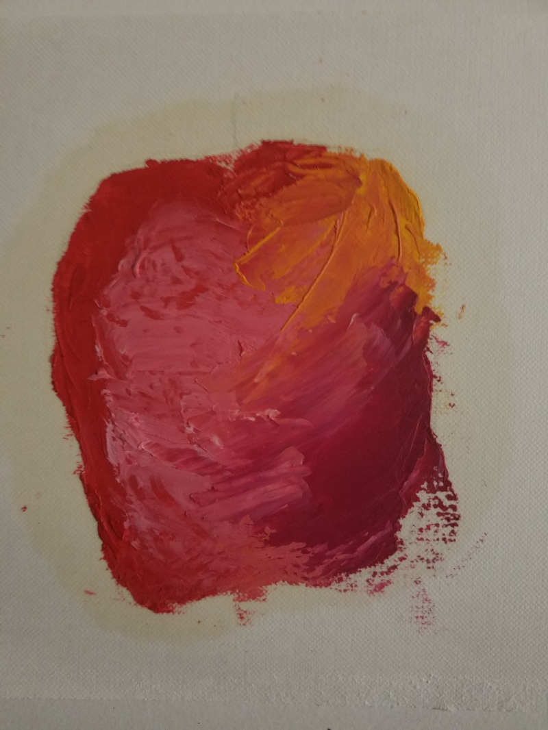
Apples and Oil Paint
|
|
When I say this was a challenge - it was a challenge. I would have thought oil wasn't as complicated, take it that everyone around me was painting like Picasso reincarnated, so I thought hey I got this.
It was my first time using it, I will give myself that. The texture of the paint is beautifully smooth. Honestly everything about oil is absolute perfection until you put the brush on the canvas and you literally have no clue what to do - you just do it and pray that the results aren't all that bad.
And, might I say my apple looks pretty good. I will give myself props for the use of the "autumish" colors, it was fun just mixing and trying something new. I wish I had added more of a highlight, a light source of some sort to the apple because it definitely looks flat. Also the second photo was fun yet a headache all in one. We used the palette knife which was different and provided an awesome texture, until I tried it out and oh boy. The picky perfectionist in me did not like that at. all. But with art comes enjoyment and I truly enjoyed playing around with something new.
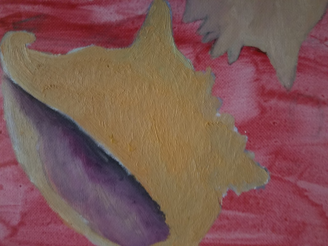
Again with the Oil Paints...Progression
|
So of course, we got a taste of oil paint. Then came the whole feast. I can't exactly say much about my project since it's still a work in progress, but so far it's something I'm going to have to sit down, relax myself and get to working.
I began to draw the seashells in pure confidence, then came painting, then came the "why aren't the paints blending and not layering - oh wait it's oil paints", then came frustration. I layered. And layered. And layered. With oil paints layering is vital, that's basically with every type of paint. Once the oil is dry, hey, add some more. Get some texture in there. I got the memo but it didn't really process in my head until afterwards when I was left with a orange blob shaped in a conch shell. Advice from my teacher will definitely lead me in a good direction. I will certainly touch more spots, do my thing until something pleasing to the eyes is finally created. I now know that oil paint is no joke. One has to master it. To master it takes practice. Everything takes practice. Will I decline the use of oil paints a second time? No, of course not. Oil painting will be something I will continue to work with. |
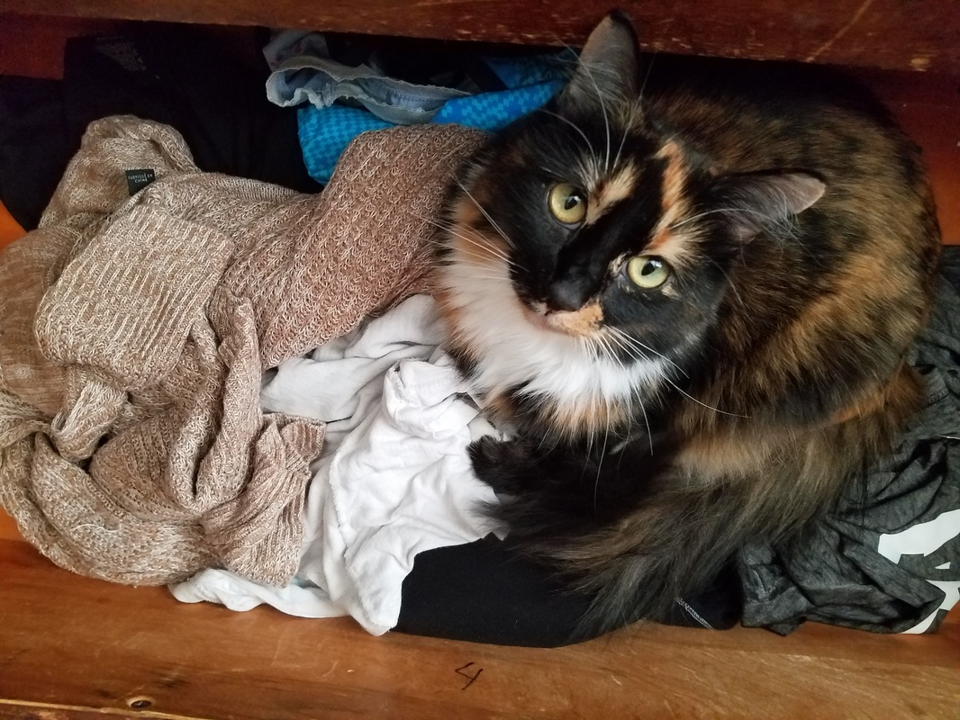
Interior Space.... Progression
|
|
So many ideas were spilled out for this project I was so excited to draw and get to working - then something hit me that it would most likely take me, Leonardo Davinci the II, a bagillion years to finish. My time management is something I clearly need to work on.
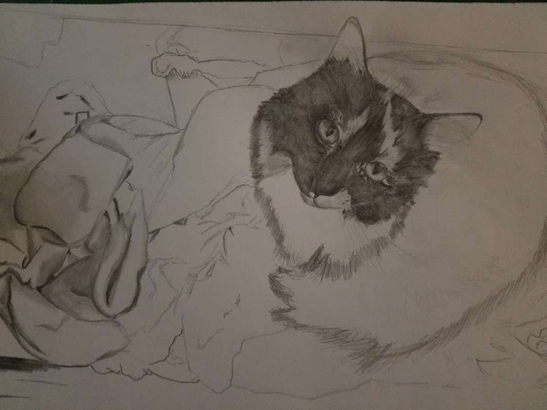
My backup plan was this one - a photo of this precious fiend sitting in my dresser (one of her hideouts). So far the clothing is great, I must draw in the shading, texture and make it become actual clothing. Easy. Then comes my cat, with fur and eyes - but that wont stop me.
As I'm doing this, the fur is a hard challenge. Since her face is mainly black, it was hard adding value where I couldn't see it in the photo. Plus, I couldn't find a pencil dark enough.
Classmates suggested I use charcoal, but sometimes charcoal is a bit too heavy - but it might work out for this piece once I try it. Her eyes are my favorite part - even though they aren't as vibrant in the picture, she typically makes the "why are you taking my photo" expression like the one I depicted in the picture. I've drawn fabric before, and I think I'm getting a bit better. I hope this drawing comes out a bit more realistic but so far - eh. The more I work on it the more I know I will soon enjoy it.
Inktober!!
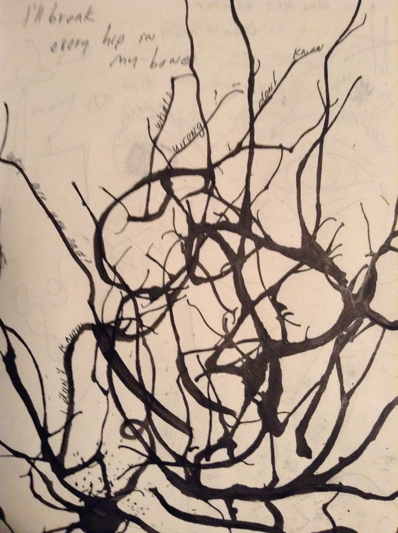
The picture's a bit blurry but I think it makes this photo even more interesting. So we had a little fun - with ink!! This was actually pretty entertaining. We were supposed to make ink monsters, but as I continued it was really looking a lot like tree branches. Hm, I decided to be a little unoriginal and did just that - tree branches. But, I loved it. It was an interesting way blowing on the ink and watching it do its own thing into something beautiful. Quite beautiful actually. I threw in some quotes in there (I decided to do this in my 'personal sketchbook, haha) and boom I fell in love. Probably my most favorite page honestly. I would love love love to do a piece just with ink, I've always wanted to and I really appreciate this kind of style. Definitely something I'm going to get into in the future.
Self Portrait...Progression
|
|
|
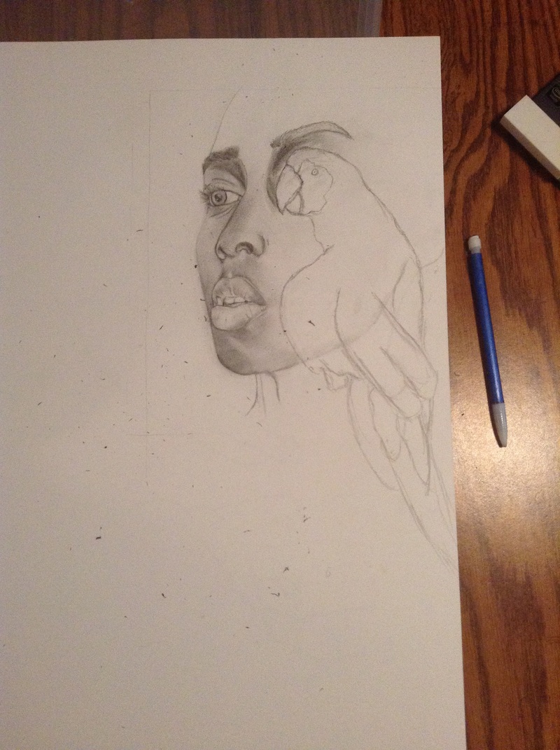
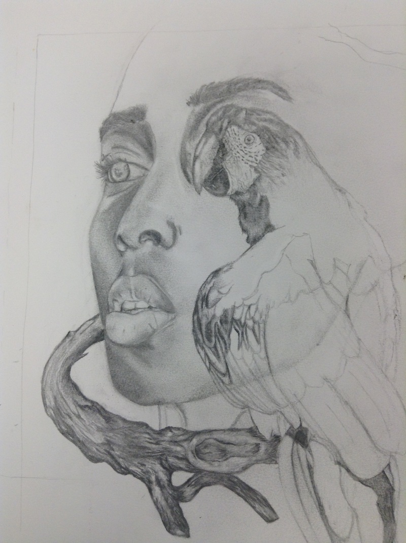
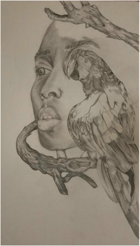
This piece is my most enjoyable piece so far. I loved working on this self portrait. I definitely improved compared to my self portrait from last year in drawing.
Now, I'm a bit indecisive. I jump from many ideas that it's hard to do one. But I did want to incorporate some sort of animal theme to this, and my original idea was feathers - a bird theme.
And I stuck to that. Drawing to me is about accuracy of course. When I draw from a picture, I want it to at least look a bit similar. With drawing portraits or drawing something in general, I sketch in layers. I do a rough drawing just to get the general outline, then I fix that rough sketch to my liking, then I go over and over and over until it eventually looks right to me. This is a bit of a process but it helps me. Of course I struggled with the proportions. The lips was the hardest part.
But, overall I really love this piece I hope to do a lot more the future.
Animal Portrait
This is my first project that I've done in pen. Was this challenging? Not exactly, in fact...this was really fun to do. I love the feel of ink, of pen just like a pencil I feel free to do, and add, whatever I want with satisfying results. The texture of the hedgehog is what I am very happy I accomplished. With the pen being so easy moving and free, I was able to just go in all directions without messing up. The fur, or spines? took a lot of itty bitty patience. I had to balance the dark and light parts of each little spine. I think I accomplished this well, as well as the texture on the face. The the hedgehog was all scrunched up and cute, and I like to say I created this through the picture with the texture on the front of the hedgehog, and not just make it flat. I wanted to show the texture around it's arms, that weren't just straight fur, it curled, it encircled the arms, and was really ruffley looking on the tummy part.
I truly enjoyed doing this. What I would change is the background, I wanted to make it simplistic and not add a lot of details because the hedgehog was so detailed, but I don't think I added enough and I will go back to work on that.
I will definitely love doing pen work in the future.
I truly enjoyed doing this. What I would change is the background, I wanted to make it simplistic and not add a lot of details because the hedgehog was so detailed, but I don't think I added enough and I will go back to work on that.
I will definitely love doing pen work in the future.
Landscape
This project had to be the most challenging work I've done so far. I wanted to escape my comfort zone, and wanted to experience creating a complete work with watercolor. Though I was excited, my pass experiences warned me that this was going to be time-consuming and require a lot of patience. I didn't mind that, and while working I was quite impress on how it was beginning to look. But, as time moved on and the project was continuing to progress, the piece wasn't starting to work with me. It started when I tried tackling the water. So far, while working on the rocks, I did a lot of layers to give it this some what realistic work. If I had to be honest, it took quite sometime getting every highlight, every shadow in the rocks that's what sadly, they are uncompleted. I added blues, grays, red, browns, so many layering that was somewhat enjoyable because mixing the colors was actually fun. It's when I began doing the water that everything was kind of going downhill. As much water that I added to the paint, it ws becoming extremely thick, and made the material I was painting on warp, but that was no biggy. I continued to layer, and add colors that I saw, light colors, white, light blue, dark blue, purple. I know this being my first time tackling a piece in water color, it wasn't going to exactly look like the picture, which was fine. As I worked on it, I was eventually becoming satisfied with the water, even though I still believe it was way to thick then it should have been. I continued to work on the water...and this is where the struggle began. the reflection of the trees on the water I knew was going to be the most difficult for me, but I was excited to see what I could do. Right away, it was becoming too dark, too blotchy and too thick. Now, the blotchiness was totally okay, since the tree's reflections were distorted, blurry, blotchy. But for some reason, the contrast of the trees and the waters weren't mixing, and unfortunately created somewhat of a mess. The texture that I was aiming for and accomplishing, soon got rough, and trying to fix the problem and layer, layer, and layer was honestly making the problem worse. Instead of asking my art teacher for assistance, I went ahead of myself and cut the top half of my piece that didn't complete the piece - basically the part that I messed up on. I actually think it looks a lot better this way, because what I had before was like two halves of completely different art works taped together. It just wasn't complete, and of course it still isn't.
What I would add is more water, and I would have to mingle with the tree's reflections so it looks like a reflection somewhat, instead of just THERE. I enjoyed doing the rocks, so I will of course go back to them and not neglect them like I have. Even though this project was a challenge for me, and water color is a different kind of paint that I haven't really tried before, I really learned a lot. I'm not one for working with color, so at first I thought I wouldn't get the colors down..but layering and finding undertones and mixing this paint with that and actually making it work, was really fun. Would I work in water color again? Of course, though it wouldn't be my first option I would love to try this again, and continue to progress and learn more.
What I would add is more water, and I would have to mingle with the tree's reflections so it looks like a reflection somewhat, instead of just THERE. I enjoyed doing the rocks, so I will of course go back to them and not neglect them like I have. Even though this project was a challenge for me, and water color is a different kind of paint that I haven't really tried before, I really learned a lot. I'm not one for working with color, so at first I thought I wouldn't get the colors down..but layering and finding undertones and mixing this paint with that and actually making it work, was really fun. Would I work in water color again? Of course, though it wouldn't be my first option I would love to try this again, and continue to progress and learn more.
Nature vs. Mechanical
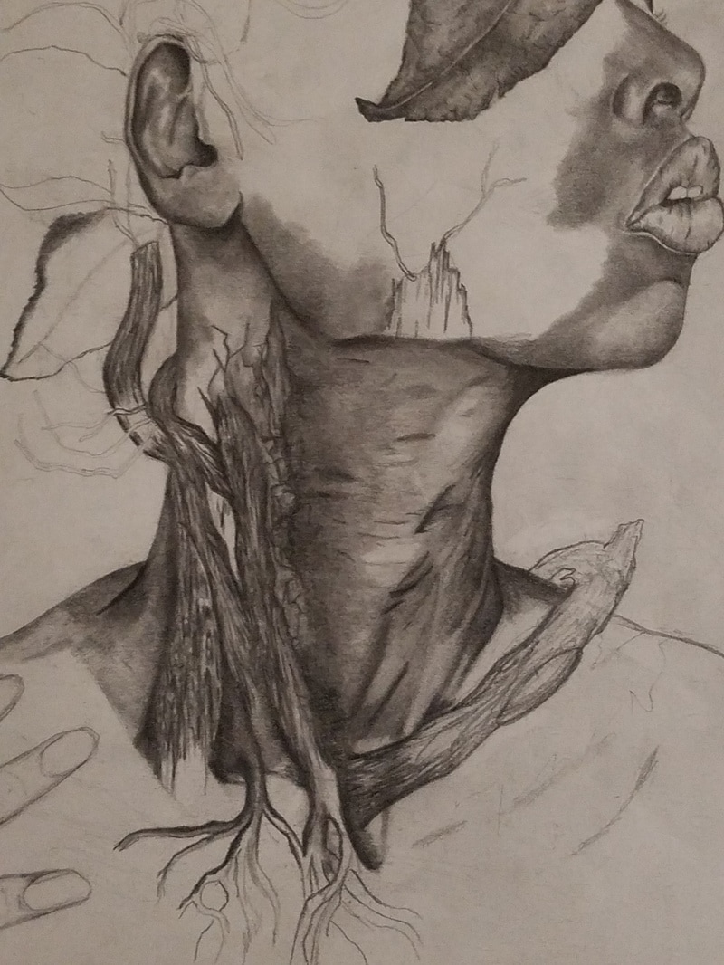
For this Nature vs. Mechanical piece, I wanted the body to be 'consumed' by these two elements in way. The reason I drew the neck and shoulders is because I wanted to flaunt other features of the body other than the face. I decided to do my neck because my neck is long, and the length of it reminded me of a tree. That's why I decided to incorporate tree branches and bark. I'm obsessed with tree branches. But, while doing the tree branches and bark, I think I went either too dark or not dark enough. I wanted to embedded the tree bark to the skin, but I believed they have similar tone that just makes the bark drown into the skin instead of standing out. It's either I need to go darker on the bark, or add highlight to the skin. My gut is telling me it's the latter, since this is a typical flaw I have in my drawings. I tend to leave out highlights, and I go too dark and heavy in my shading. Or, I don't go dark enough and there's too little highlight, and too little shading which I believe is what's happening to the tree branches. They don't have curve to them, they are too flat.
Blending is another challenge I had with this piece. Shadows under the chin are not blended well, to me they stick out a lot and do not transition with the rest of the shading. And that is something I am beginning to see a lot with the lines in the neck. They look like drawn out too dark lines, and not like neck wrinkles which they are. The neck looks rough and not smooth like I hoped it to be. Also with the neck, I found myself over-blending and that made the texture of the paper rough as well.
This has to be my favorite drawing I've done in this class. It captures the concept that I wanted, and I want to do work similar to this in the future in AP art.
