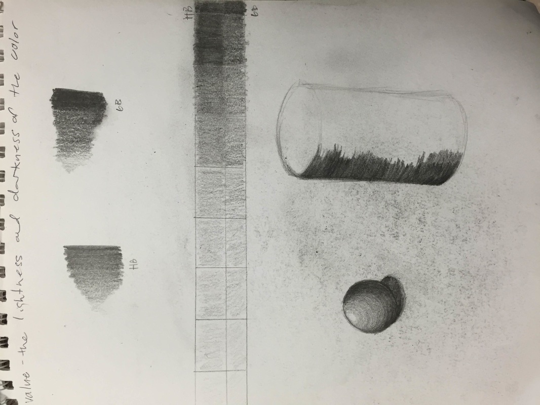
  In this project, we were assigned to draw transparency using value to show lighting and to making it look transparent basically. I am unsatisfied with my work, but it is my fault for it was rushed. To incorporate the 'transparent' look, the class was taught to go lighter on the value when it came to the 'see through' parts of the object, and go darker were the light is showing, which was a great tip and taught me well on how to do transparency and opacity. I do wish I did my timing well when doing this project to have a neat, clean well thought out final piece, but I won't say I did entirely awful. I do need to practice more.
0 Comments
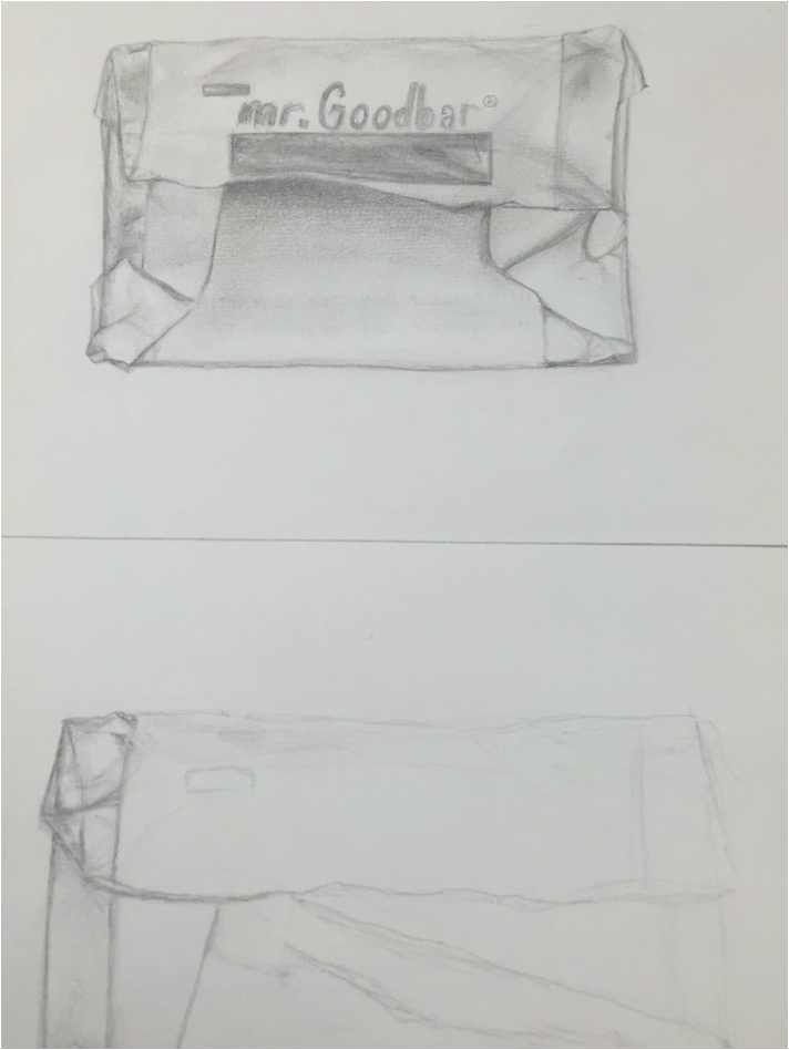 The class and I learned how to draw progression by drawing candy being unwrapped. This assignment wasn't a challenge, but the pace was too fast for me. I tried my best, especially with the wording, and while analyzing, it wasn't quite right. But, I did try improving it by erasing and using a bit more values, and I'm satisfied with it so far.
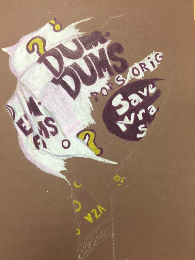 In this assignment, we were assigned to use Prismacolor Color pencils drawing a DumDum lollipop through our perspective. I did find this a challenge because it was a little hard trying to show shading and lighting on the wrapper through my drawing, and the use of Prismacolor compared to just regular pencil was new. But, I do like how Prismacolor is darker, it makes the picture look more realistic. While analyzing my drawing, it was hard getting the lollipop not to look so tilted, and the colors not to look so cartoonish. But, overall I tried my best.
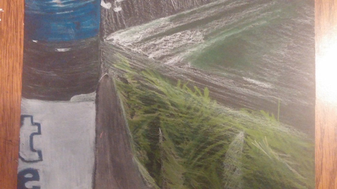
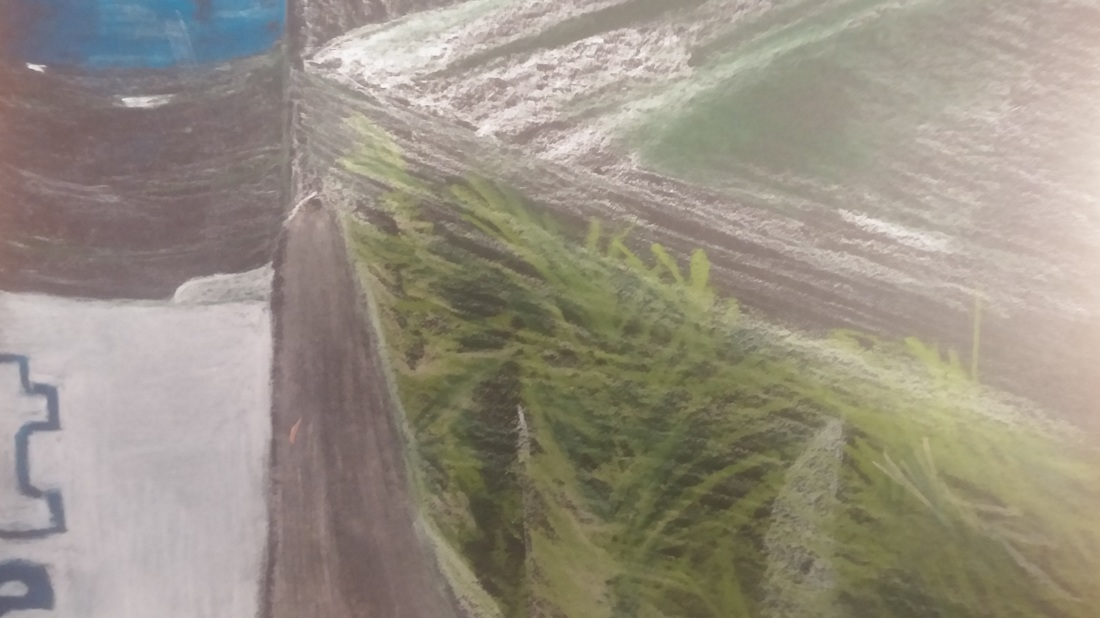
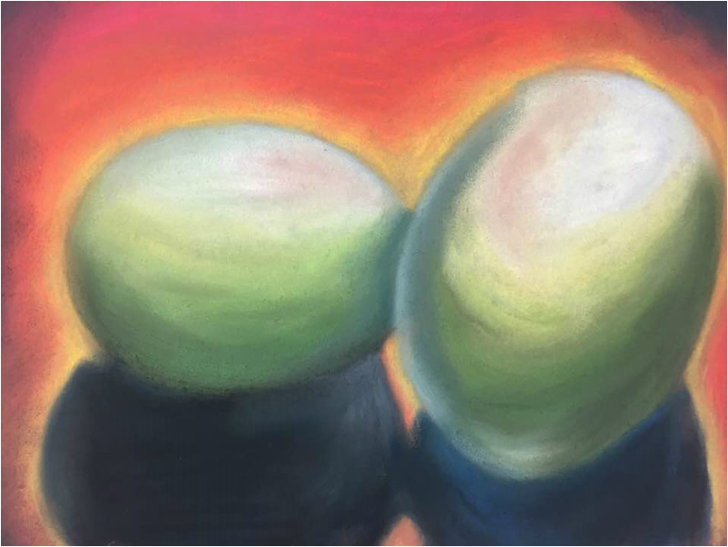 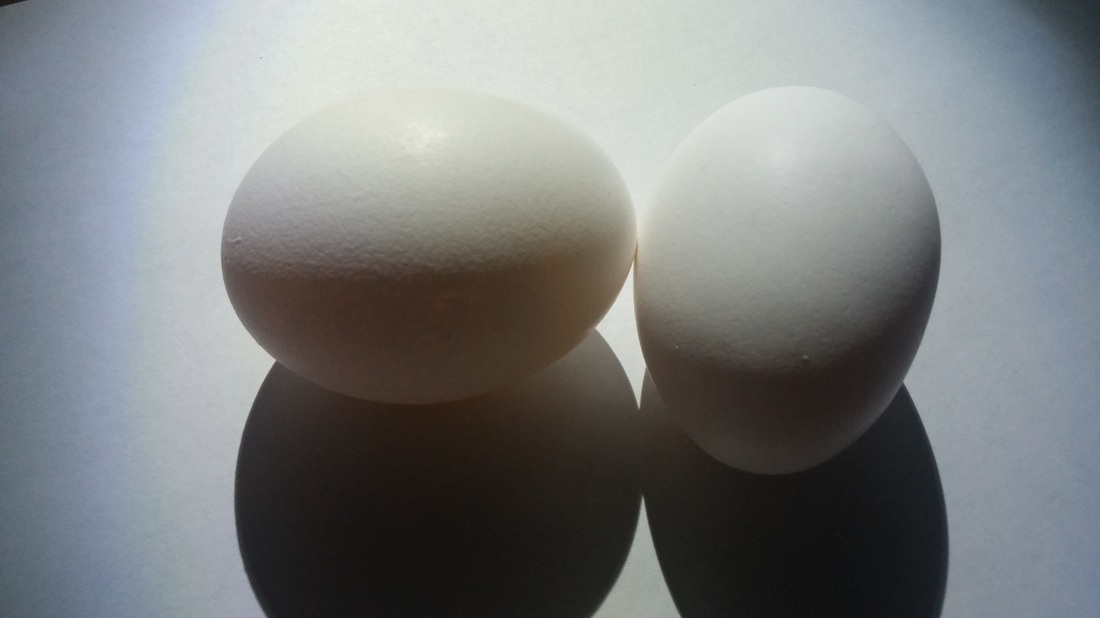 We started experimenting with pastel chalk and pastel pencil, and were assigned to draw a picture of eggs we took ourselves. The eggs were a challenge, and took me several times to actually get something, thought the proportion is very off, I am satisfied with it. The class was told to use cold and warm colors throughout the picture so I decided to use a green, blue scheme for the eggs, and a vibrant warm orange, yellow and red scheme for the outside. I did consider these
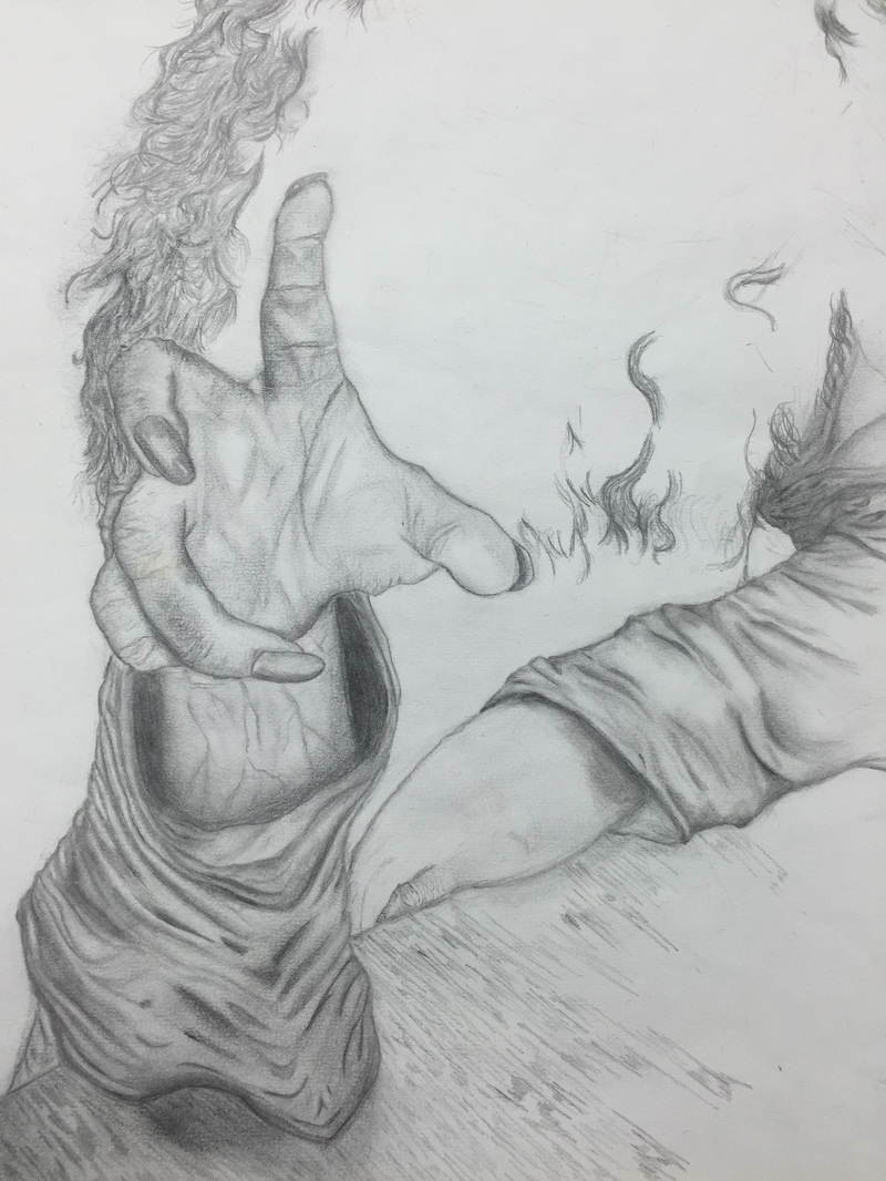
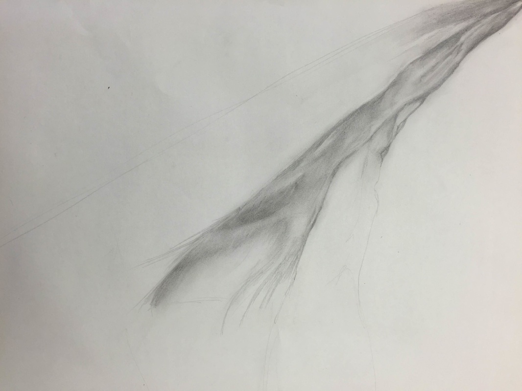 This was my favorite assignment - learning how to draw fabric. I already knew some technique but this exercise made me improve drastically. It was something new, I learned how to use incorporate the lighting to make the fabric look realistic and smooth just like the texture. The class also experimented with charcoal as well, but I think I did well with just pencil, and controlling it a lot better. While taking a step back and analyzing my work, I did see that I did develop some skill when it came to fabric drawing,
Sketchbook Shape Drawings:
In this sketchbook assignment, we practiced drawing shapes using different materials, to show depth and realism. Since I did this exercise before, I already know the techniques on making the shapes look 3D, so this was easy. Contour Line Room Drawing: Modified
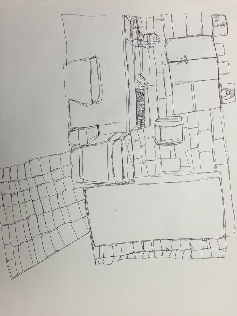
The class and I were assigned to draw our surroundings of the class room doing a contour line not being allowed to pick up the pen. This assignment was a struggle for me, because it was quite hard getting the details I saw, without getting to sketchy with it. Overall, I'm a little satisfied, but this practice helped a lot. 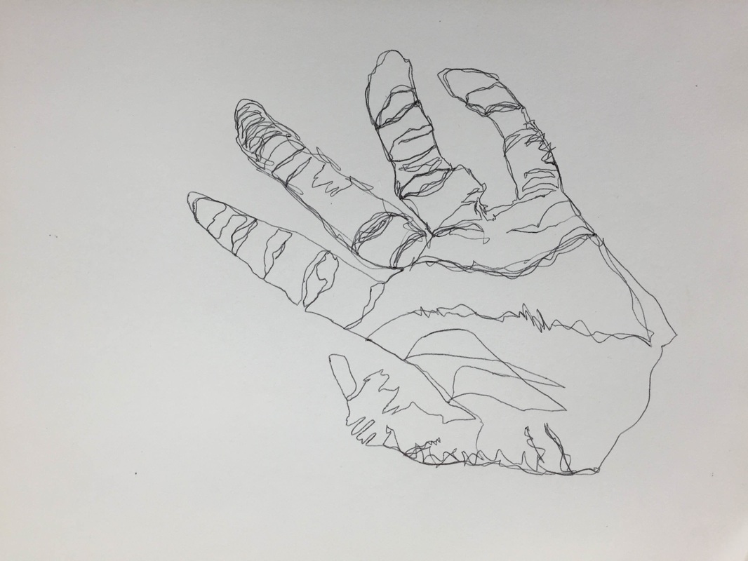 Contour Hand Drawing: Modified
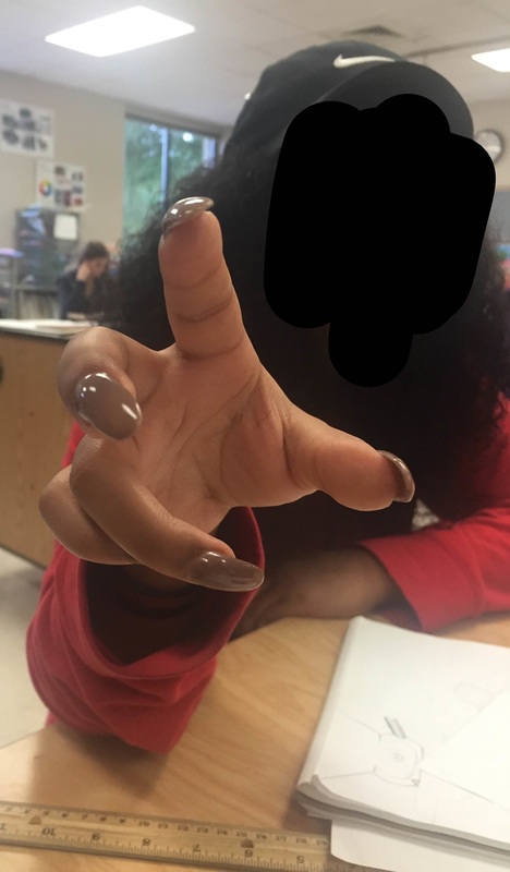
With this sketchbook assignment, the class and I were told to draw a modified (meaning I can look down at my sketchbook while I draw the subject) of our hand. Compared to the other blind contour drawings of my hand, this was a big improvement. |
Author16, Junior @ Apex High School Archives
January 2016
Categories |
 RSS Feed
